There Are So Many Mediums to Do Art.

My brush collection is huge. I found I can fill a coffee cup with raw beans and poke the handles in to hold the brushes upright. It is easier to select the ones I need.

How do I choose?

First think of what you want to paint.

What medium seems to fit your idea? Follow up by experimenting with one that would be best. It can be a combination of several media or just one. Do a rough painting sketch of the main forms but no details. What color would be best for the main idea or what we call the center of interest?

I do a lot of Mixed Media with acrylics, meaning I might add a paper and collage it on or I might tear up an old painting I do not like, and use the pieces. I think of the style I want to express my idea. Will I use strong outlines? Or smudge the outlines for a filmy look? Be sure to overlap shapes. Don’t leave space around each one have them tough or overlap so the composition flows and there is a sense of direction to move around the artwork.

You are like a symphony director. You need to tell people how to move around your art.

When I select my colors, I consider the art elements like LINE, SHAPE, FORM, TEXTURE, VALUE, COLOR, SPACE (or dimension). My best work uses texture, color and value. Will my texture be real and tactile so that I touch it and feel it? If so, I would choose heavy gels or heavy gesso (pronounced jes-O) to raise up the canvas or paper surface before I paint. If I want the texture to be visual, I will paint the texture into the art.

Because I have been painting for half a century, I am very familiar with the interactions of colors so I try not to mix ones that will make my painting muddy. Is you use a color wheel and do not mix the colors opposite each other unless you really want a gray-brown neutral.. However, I will use opposites, called complements, to dull a too bright color.

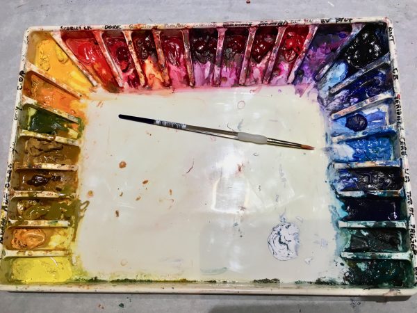
For starters, pick 4 colors you seem to use most of the time. Restrict your painting to only those colors and make several sketches with a thin brush. My favorite four are yellow-orange, Golden Quinacridone crimson (or a cool red), Golden turquoise blue and a. blue-violet. Actually if you look at the color wheel, my colors are called a split-complementary color scheme.

https://www.google.com/search?client=firefox-b-1-d&q=color+wheel

Here is a link to several kinds of wheels. Look for the primary triad- red, yellow and blue. Look at yellow orange and blue green. Then find the red and blue. What are the colors on the other sides of red and blue? Try using those with the yellow-orange and blue-green. Paint a bunch of squiggles in each color all over the paper. Allow some to overlap to see what happens. Do you think they complement each other? In other words, do they ‘pop’ when you use them together? This is what you after.

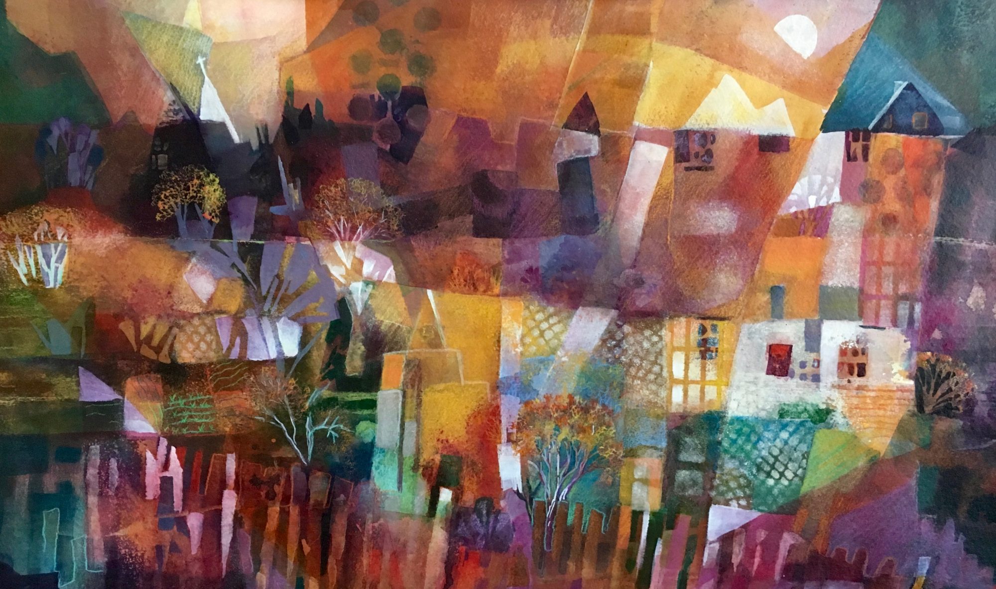
©2018 Marsh Gegerson, High Sierra, Watercolor, 15×17″ $700.

Look at my painting above. I used a split complement scheme. yellow-orange, red, blue-violet and turquoise or blue green. They seem to enhance each other.

Find your colors, your style by using a few of the art elements and make several paintings.

Don’t use them all. Pic two or three. For instance, try outline (line) and shape ( geometric and free form shapes) then add space by overlapping some and leaving one or two alone. Play with it. Don’t get serious about it. Be spontaneous. It will come and soon you will have YOUR style.

How do I use colors in my paintings to make them “pop”?

You need to understand basic color theory. It is not hard, really. First, Google “color- wheel” images, and you will see many to refer to. Learn how to paint the third layer or ‘tertiary’ ones. That is easy too. They have double names like ‘red-orange’.

My color palette is usually the same that I have used for years. It has become my ‘brand’.  It enables people to identify my work and when I look at my portfolio, I can see similarities in both my style and color.  My colors are ME and are part of my identity.  I like to wear them, decorate with them and paint with them.  However, it took me years to figure this out because, I was afraid to break the invisible painting rules in my head.  What freed me was when I decided to experiment with color and really thought about which colors I loved together.  I began making paint charts of all colors on my palette and noted how they mixed together to make new ones. In fact, I give my students an assignment to mix 16 greens from just red, yellow and blue.  I was not trying to be cruel.  I wanted them to look at nature and see the variety of green in it. They needed to get out of the habit of just using ‘paint tube green’.

For my work, I use a double-split complementary color scheme. Employing the full 12 color wheel, I found commercial paints that keep me in my color scheme but with some variety because many of them are hues of those basic colors that I use. For instance, for magenta, I also have a red-violet and a rose color and a warm magenta-with some orange tint to it. I only use a scarlet red for accent.

From this palette, I will choose a yellow hue, magenta, turquoise and a violet, and maybe add a light blue. This gives me a double split complement with some cheating. You can see that I have several varieties of yellow, magenta and blue greens on my palette. I use one violet because I can mix it with one of the magentas or a blue-green. Magenta will not muddy other colors like a bright red.

How do you split complements? On the color wheel, if yellow is at 12 o’clock, I choose the two colors on either side of it, which is orange and yellow-green. Then I go to the complement of yellow, which is the violet directly opposite. I will use the two colors on both sides of it which are red-violet (magenta) and blue-violet. That is my ‘double-split complementary’ scheme. I cheat and add a blue-green for contrast which is viridian for making turquoise, but be careful. Viridian is a dye color and dominates, so only use a little. Below, you can see how I have used these four colors in my painting. They layer really well and do not make ‘mud’.

So, try playing with color. Know which ones NOT to mix together so that you avoid making mud. Paint the combinations on a watercolor paper and write down the paint names you used for each sample. Draw an X over the samples to avoid. After a while, this will come naturally and color mixing will be fun, not a chore.