You need to understand basic color theory. It is not hard, really. First, Google “color- wheel” images, and you will see many to refer to. Learn how to paint the third layer or ‘tertiary’ ones. That is easy too. They have double names like ‘red-orange’.
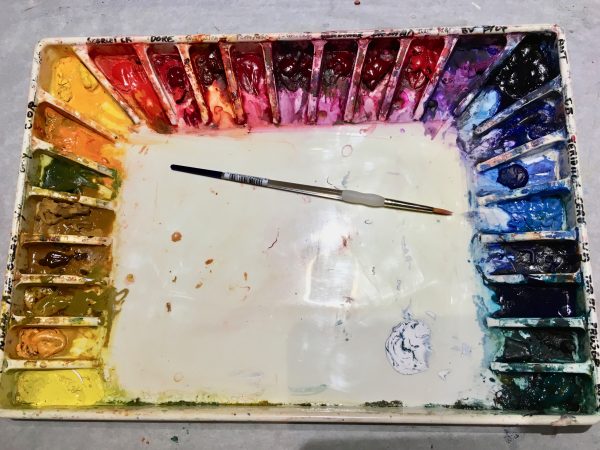
My color palette is usually the same that I have used for years. It has become my ‘brand’. It enables people to identify my work and when I look at my portfolio, I can see similarities in both my style and color. My colors are ME and are part of my identity. I like to wear them, decorate with them and paint with them. However, it took me years to figure this out because, I was afraid to break the invisible painting rules in my head. What freed me was when I decided to experiment with color and really thought about which colors I loved together. I began making paint charts of all colors on my palette and noted how they mixed together to make new ones. In fact, I give my students an assignment to mix 16 greens from just red, yellow and blue. I was not trying to be cruel. I wanted them to look at nature and see the variety of green in it. They needed to get out of the habit of just using ‘paint tube green’.
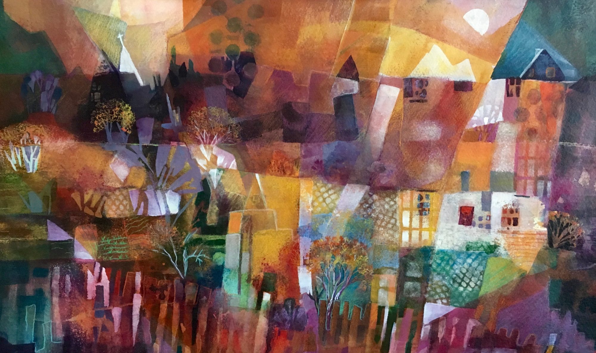
For my work, I use a double-split complementary color scheme. Employing the full 12 color wheel, I found commercial paints that keep me in my color scheme but with some variety because many of them are hues of those basic colors that I use. For instance, for magenta, I also have a red-violet and a rose color and a warm magenta-with some orange tint to it. I only use a scarlet red for accent.
From this palette, I will choose a yellow hue, magenta, turquoise and a violet, and maybe add a light blue. This gives me a double split complement with some cheating. You can see that I have several varieties of yellow, magenta and blue greens on my palette. I use one violet because I can mix it with one of the magentas or a blue-green. Magenta will not muddy other colors like a bright red.
How do you split complements? On the color wheel, if yellow is at 12 o’clock, I choose the two colors on either side of it, which is orange and yellow-green. Then I go to the complement of yellow, which is the violet directly opposite. I will use the two colors on both sides of it which are red-violet (magenta) and blue-violet. That is my ‘double-split complementary’ scheme. I cheat and add a blue-green for contrast which is viridian for making turquoise, but be careful. Viridian is a dye color and dominates, so only use a little. Below, you can see how I have used these four colors in my painting. They layer really well and do not make ‘mud’.
So, try playing with color. Know which ones NOT to mix together so that you avoid making mud. Paint the combinations on a watercolor paper and write down the paint names you used for each sample. Draw an X over the samples to avoid. After a while, this will come naturally and color mixing will be fun, not a chore.